Google Calendar
"In Focus"
A redesign of Google Calendar’s Focus Time and labeling system built around how real users stay organized and focused.
Role:
UX Designer
Timeline:
June 2025
Tools
Figma
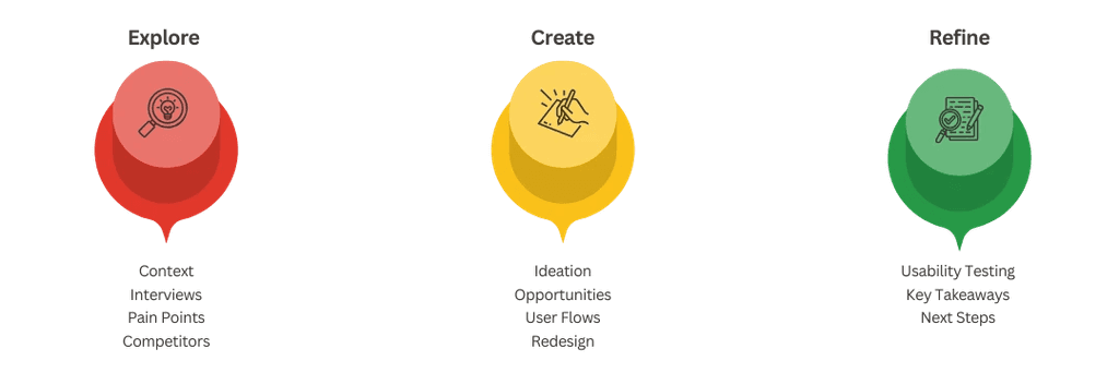
Context
"I rely on Google Calendar every day to juggle design projects, meetings, and personal life. But while it lets me schedule time, it doesn’t help me stay focused during it - and it gets cluttered fast."
This project started as an exploration into small ways to make Google Calendar feel less like just a timeline and more like a tool to focus and get your stuff done.
Research
To make sure I wasn't just implementing features that I personally wanted, I interviewed 5 users (ages 19–27) who use Google Calendar for school, work, or creative projects. I also sent out a short survey (15 responses) to explore broader patterns.
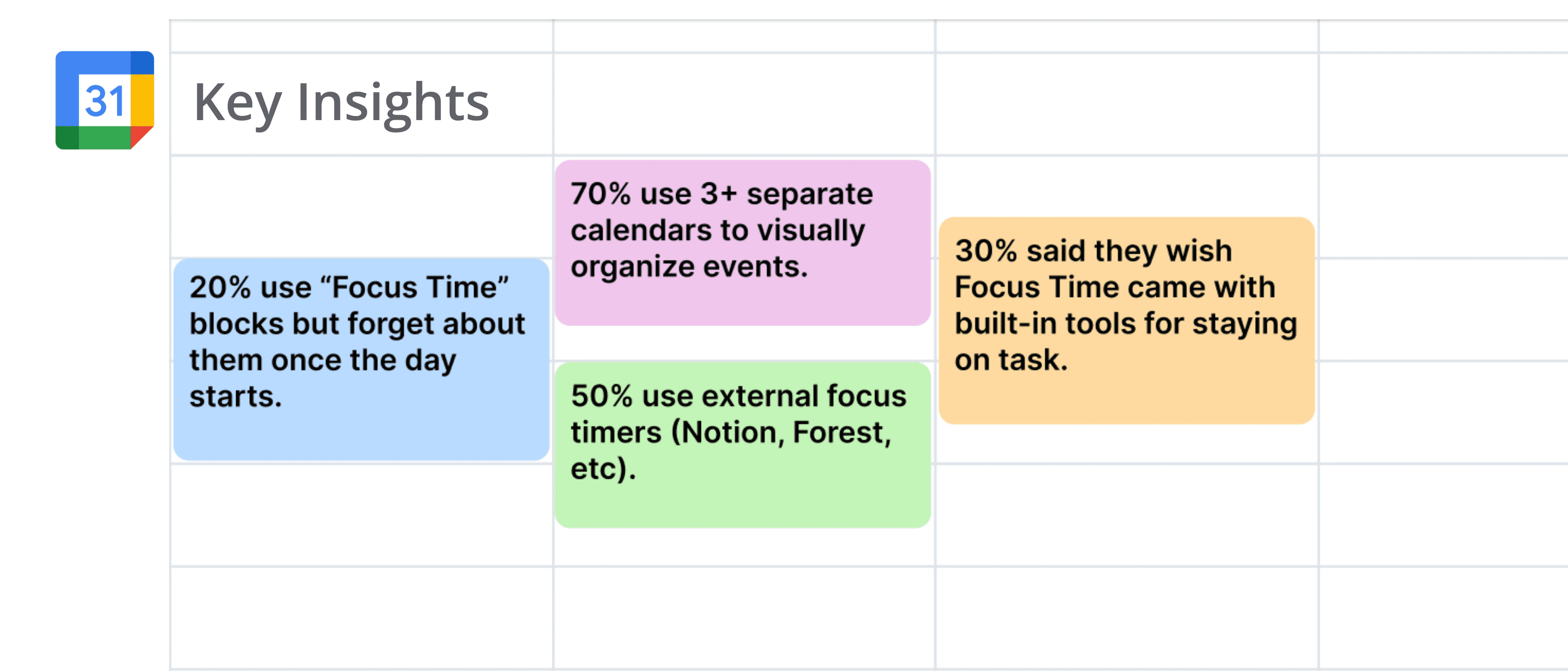
“I always thought Focus Time was supposed to help me be productive, but it’s basically just a colored event. I still end up opening a Pomodoro timer in another tab. I don’t get why it doesn’t have something built-in already.”
- Med Student, 23
“Google Calendar is my life organizer, but I’ve created like six different calendars just to manage things visually—school, work, clubs, freelance, social, personal. It’s functional, but not flexible. I wish I could just tag events or group them temporarily depending on what I need to see that day.”
- Undergrad, 19
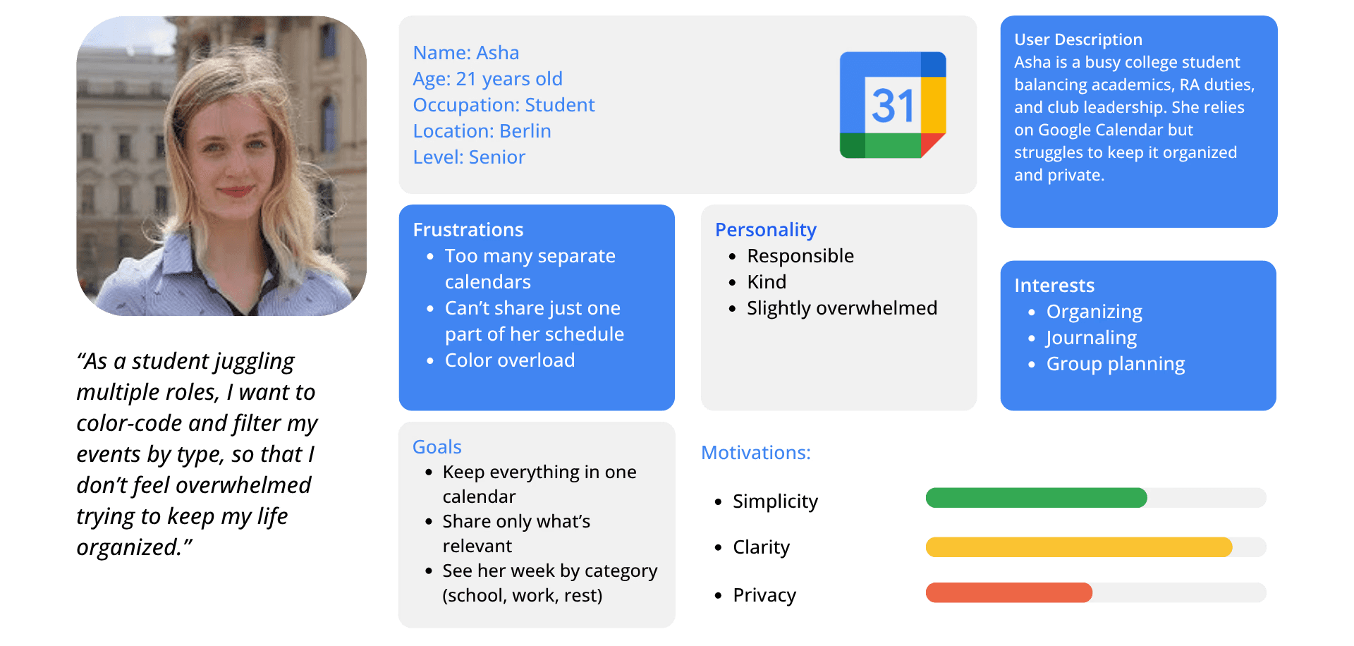
Persona Highlight - Asha
Challenges
Even though Google Calendar is widely used, designing within an existing, familiar tool meant being careful not to disrupt what already works. My challenge wasn’t to overhaul the product but to make small, intentional improvements that respected existing patterns while solving real frustrations.
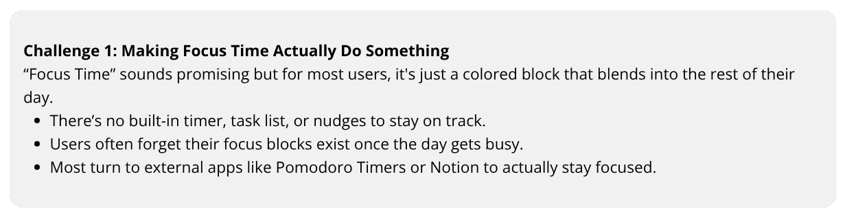
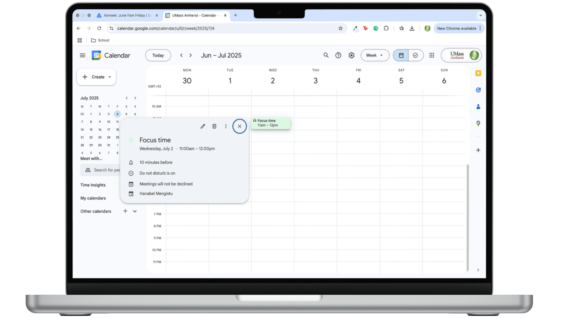
FOCUS TIME (OLD)
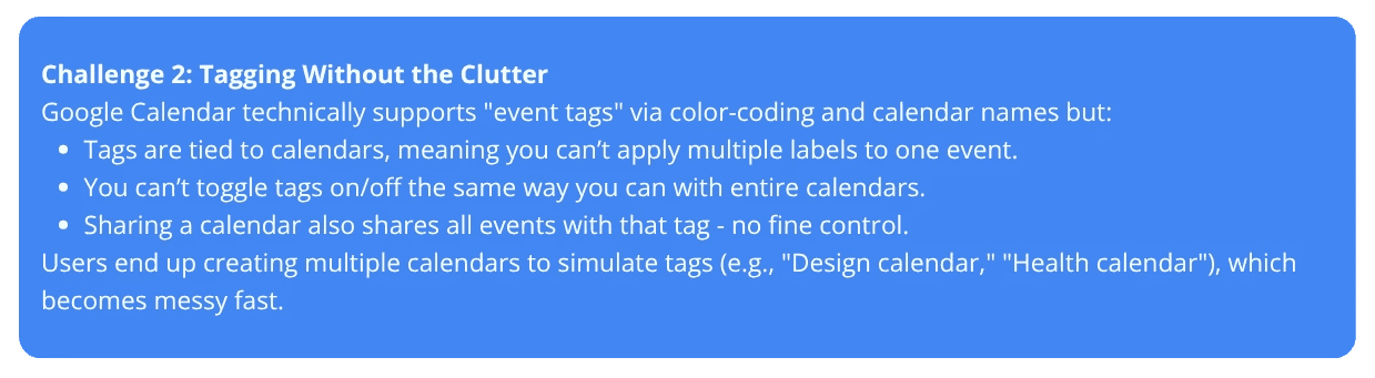
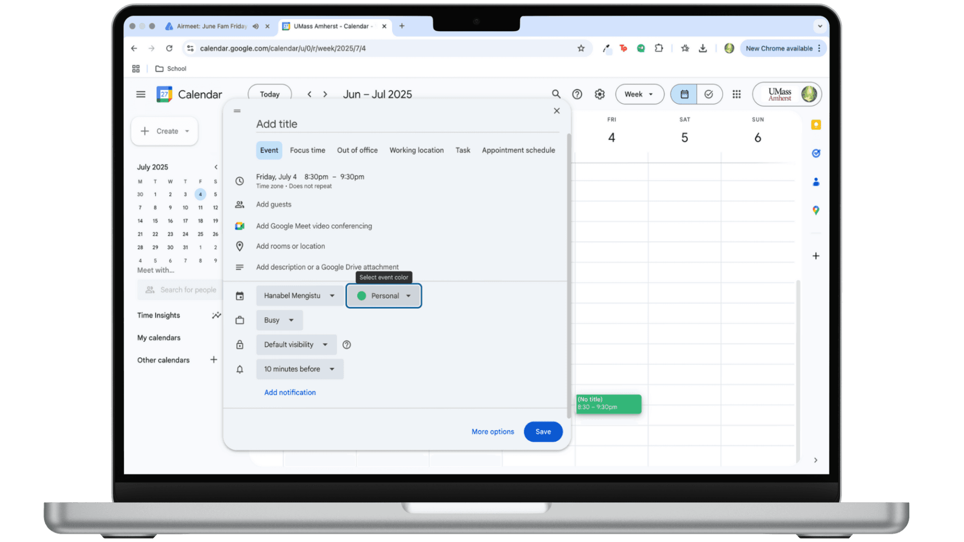
TAGGING SYSTEM (OLD)
Competitors
To understand how users are managing their time outside of Google Calendar, I analyzed three tools that were mentioned in interviews and surveys: Cron (Notion Calendar) , Forest, and Pomofocus.

Cron (Notion Calendar)
Sleek UI, keyboard shortcuts, tag-based filtering, fast interactions
Focus
Gamifies focus with visual rewards (grows a tree), locks your phone while focusing |
Pomofocus
Simple Pomodoro timer, custom time intervals, focus stats tracking |
What Google Calendar lacks:
No quick filtering by tag; not as quick to understand |
What Google Calendar lacks:
|
What Google Calendar lacks
No built-in timer in Focus Time, no task list or visual progress |
Opportunities
After hearing from users and looking at competing tools, I identified two key opportunities to improve Google Calendar.
Make focus time active.
Add a focus timer to help users stay present during scheduled focus blocks.
Most users forget Focus Time exists once their day starts
Reintroduce labels
Let users tag events and filter their calendar without needing extra calendars.
The current system ties tags in a way where it doesn't do anything but add different colors.
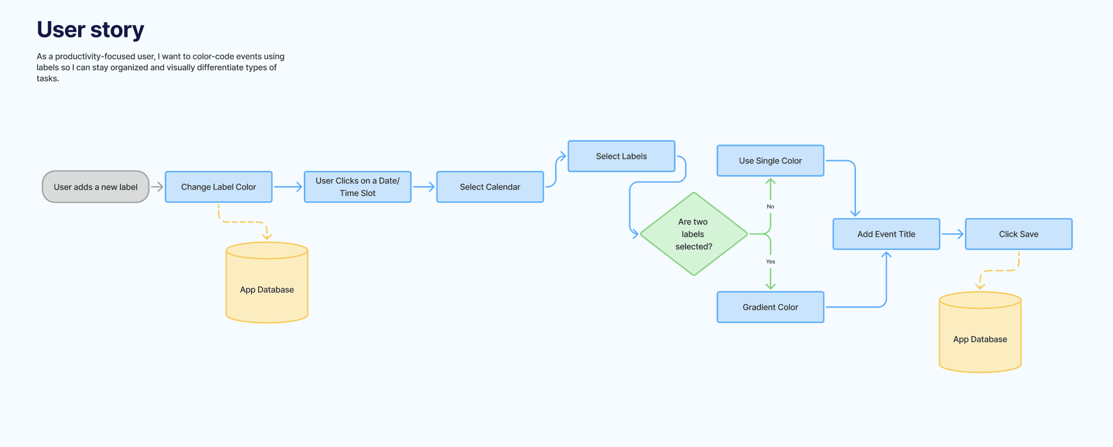
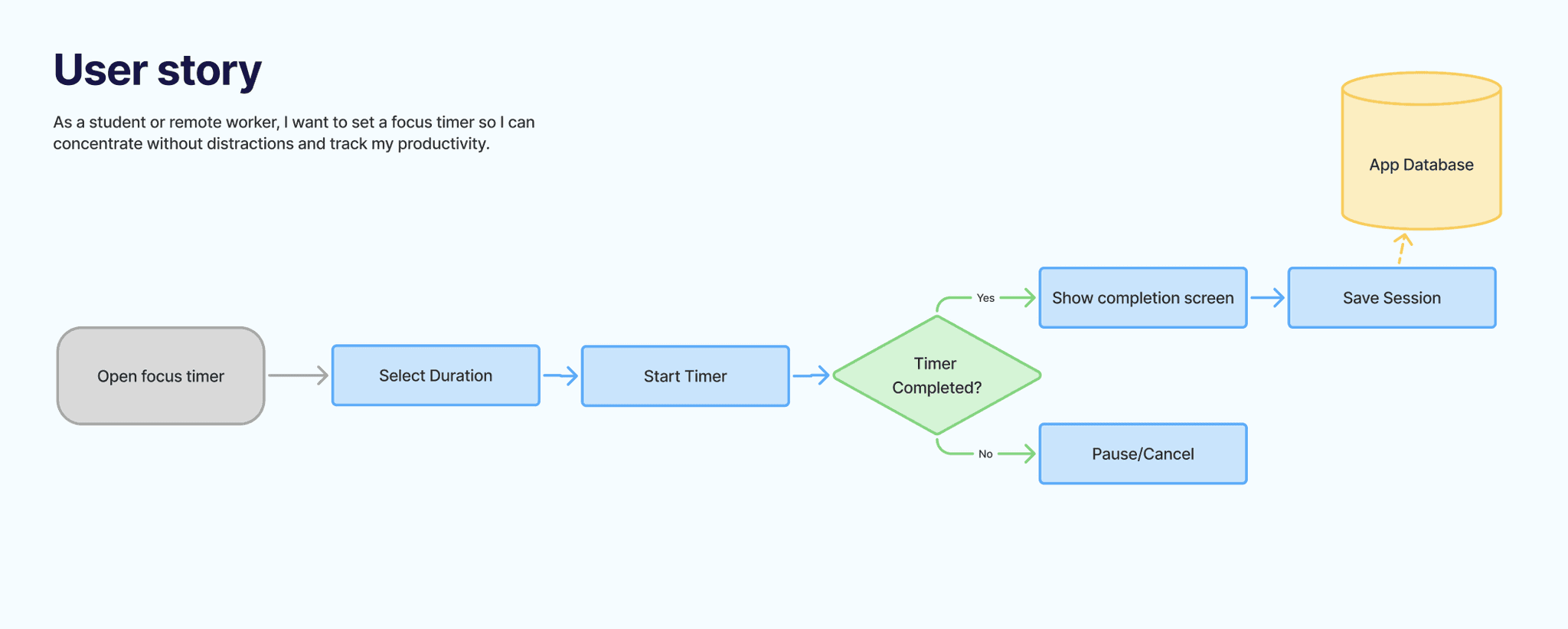
User Flows
The Redesign
New Labelling System
Users can now create labels within any calendar
Labels can be toggled on/off in the sidebar just like calendars
When calendars are shared, users can share either the whole calendar or just the label.
Events can have one or multiple labels
New Focus Timer
Focus mode can now include a timer.
They can display their progress on their calendar if that's what they choose to do.

Usability Testing
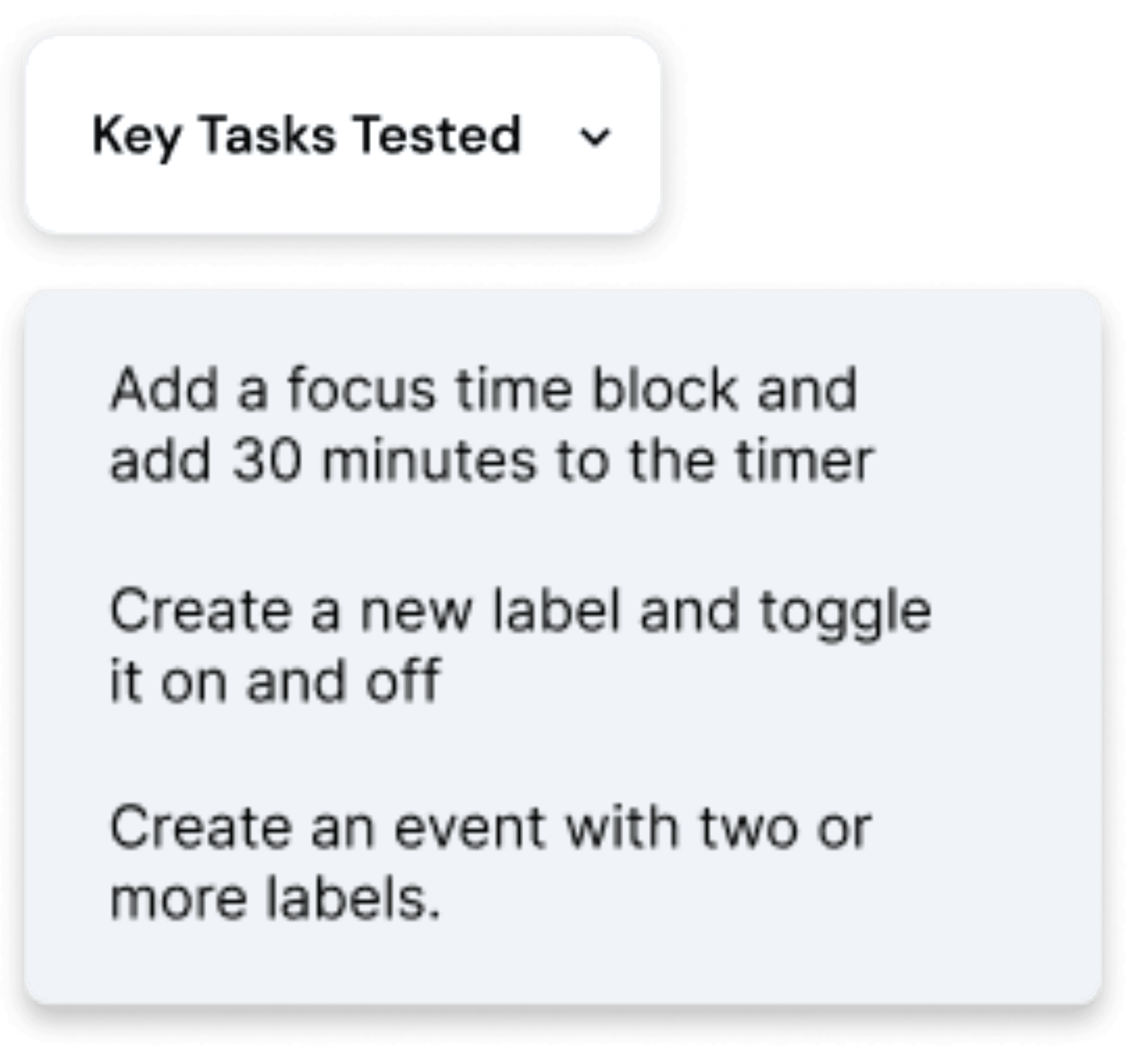
To evaluate the redesigned features, I conducted moderated usability testing with 4 participants. Each session was conducted over Zoom and lasted 20–30 minutes.
What I learned
What started as a simple idea about better labeling turned into a deeper look at how people manage mental load in their calendars. Through interviews, I saw that users weren’t just craving organization, they were trying to untangle overlapping parts of their lives.
I also noticed that Focus Time was often ignored. By adding a built-in timer, I turned it into something interactive, not just another block to skip over.
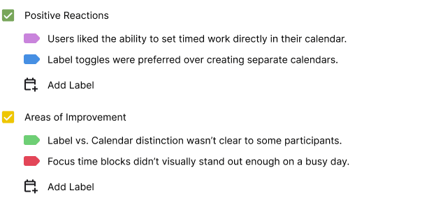
Testing confirmed these shifts worked: tags made calendars feel easier, and Focus Time felt more useful for people who timebox. This project reminded me that good UX isn’t always about more features - it’s about making what’s already there work better.
Next Steps
Explore clearer UI patterns to separate calendars from labels
Add more onboarding context for first-time Focus Time users
Consider context-aware suggestions (e.g., auto-prompting Pomodoro setup when creating Focus Time)