Lantern Chrome Extension
A Chrome extension designed to help users who feel overwhelmed by digital tools to navigate technology in a gentle, calm, and intuitive way. My teammate Lana Vu and I co-designed Lantern during UCI's 48 hour designathon, which challenged participants to build for the unknown.
Role:
UX Designer/Researcher
Timeline:
April 2025
Tools
Figma, Adobe Illustrator

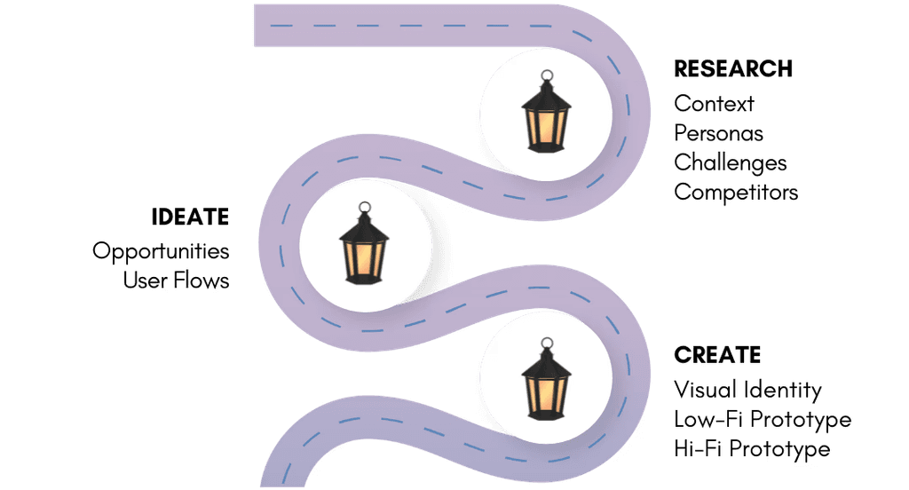
Context
Lantern is a concept for a step-by-step visual guide extension to help people navigate digital tools with ease. We didn't have time to conduct in-depth user interviews as this was for a 48 hour designathon, during a school week but we leaned on secondary research, personal experiences, teaching tech to others, and rapid feedback to inform our decisions.
We thought about the confusion and anxiety many people might feel when using unfamiliar apps, especially older adults, first-time users, or anyone overwhelmed by cluttered UI. Technology is evolving fast but not everyone can move as quickly with it. My dad, for instance, reaches for a "for Dummies" book anytime he’s faced with a new device or app. That small but telling gesture reminded us that many users want clear guidance.
Research
With limited time for interviews, we focused on secondary research and personal observations to understand how people approach learning digital tools.
From reading help forums, app reviews, and reflecting on past projects, I noticed a few recurring issues:
Walkthroughs are often skipped or forgotten about after onboarding.
Many tools assume prior knowledge.
Video tutorials are long and hard to reference mid-task.
Older or less tech-savvy users feel overwhelmed and unsure where to start.
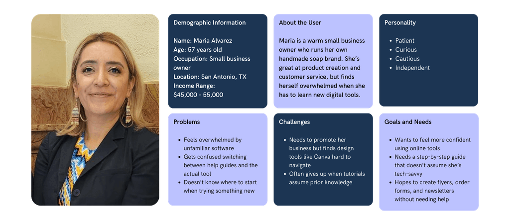
Persona Highlight - Maria
Challenges
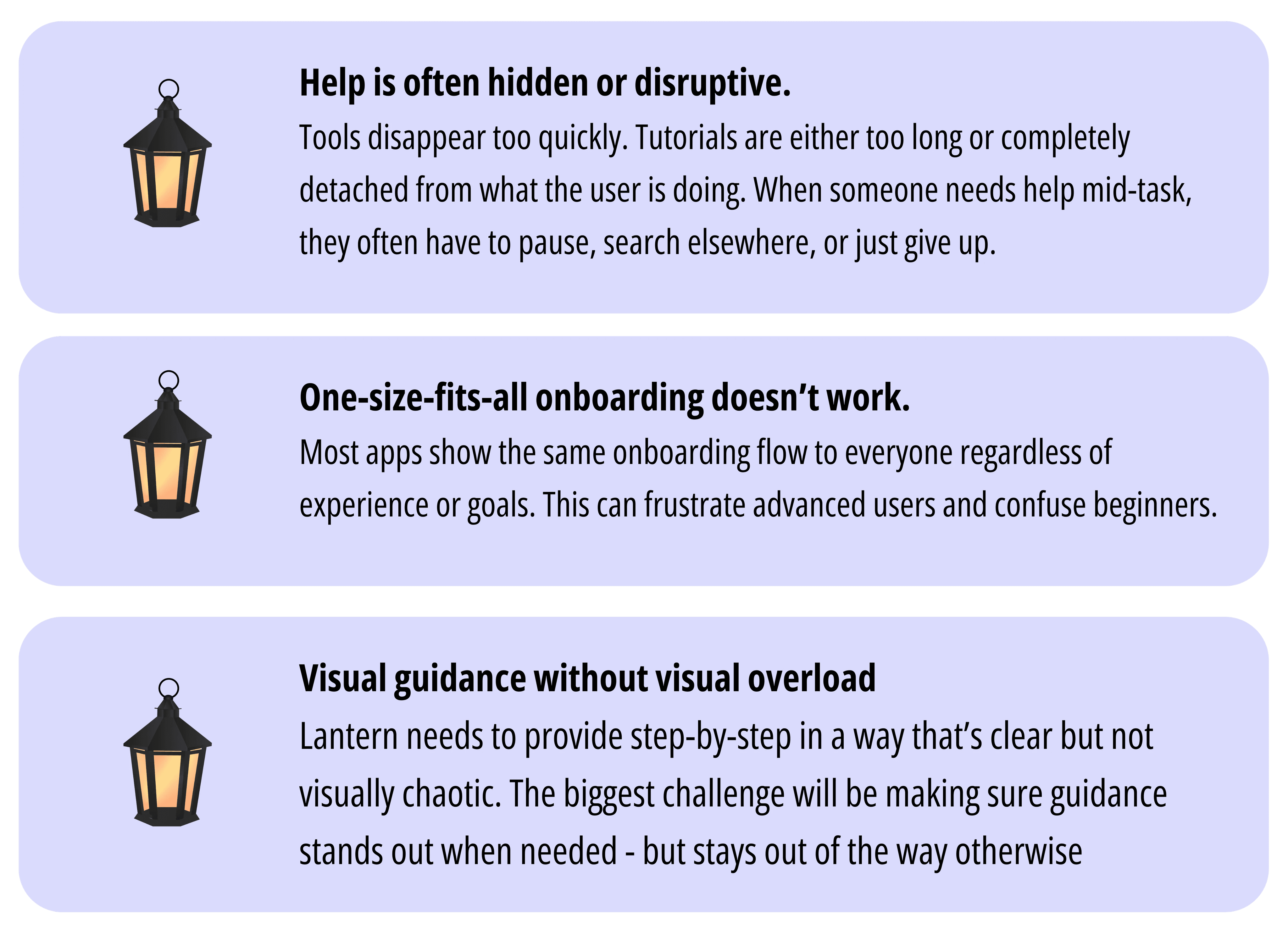
Designing Lantern came with several key challenges, especially around balancing clarity, confidence, and non-intrusiveness for users who need it.
Designing Lantern came with several key challenges, especially around balancing clarity, confidence, and non-intrusiveness for users who need it.
Competitors
Lantern is in the space between onboarding, education, and accessibility, so I looked at tools that aim to teach users how to navigate interfaces or complete tasks. While each has its strengths, most of them fall short when it comes to personalized help.
Competitors
Lantern is in the space between onboarding, education, and accessibility, so I looked at tools that aim to teach users how to navigate interfaces or complete tasks. While each has its strengths, most of them fall short when it comes to personalized help.

WalkMe
Creates guided flows to help users complete tasks in large, complex software platforms.
Strengths:
Step-by-step overlays inside apps.
Works well for repetitive workflows.
Useful for internal training at companies.
Limitations:
Built for companies, not everyday users
Focuses on efficiency, not understanding
Walkthroughs often feel rigid
Assumes you already understand why something works.
YouTube
Creators offer walkthroughs and full tutorials for just about every app or tool. Strengths:
|
Limitations:
Hard to follow along while actively using a tool.
Often too long or not focused on what you need exactly.
Requires switching tabs and breaking flow.
Help Centers/Documentation
Most platforms offer searchable help centers or documentation to explain features.
|
Limitations:
Not contextual. Doesn't know what you're trying to do.
Dense and often overwhelming.
Usually text-based with no visuals.
Help Centers/Documentation
Most platforms offer searchable help centers or documentation to explain features.
|
Limitations:
Hard to follow along while actively using a tool.
Often too long or not focused on what you need exactly.
Requires switching tabs and breaking flow.
Limitations:
Not contextual. Doesn't know what you're trying to do.
Dense and often overwhelming.
Usually text-based with no visuals.
YouTube
Creators offer walkthroughs and full tutorials for just about every app or tool. Strengths:
|
WalkMe
Creates guided flows to help users complete tasks in large, complex software platforms.
Strengths:
Step-by-step overlays inside apps.
Works well for repetitive workflows.
Useful for internal training at companies.
Limitations:
Built for companies, not everyday users
Focuses on efficiency, not understanding
Walkthroughs often feel rigid
Assumes you already understand why something works.
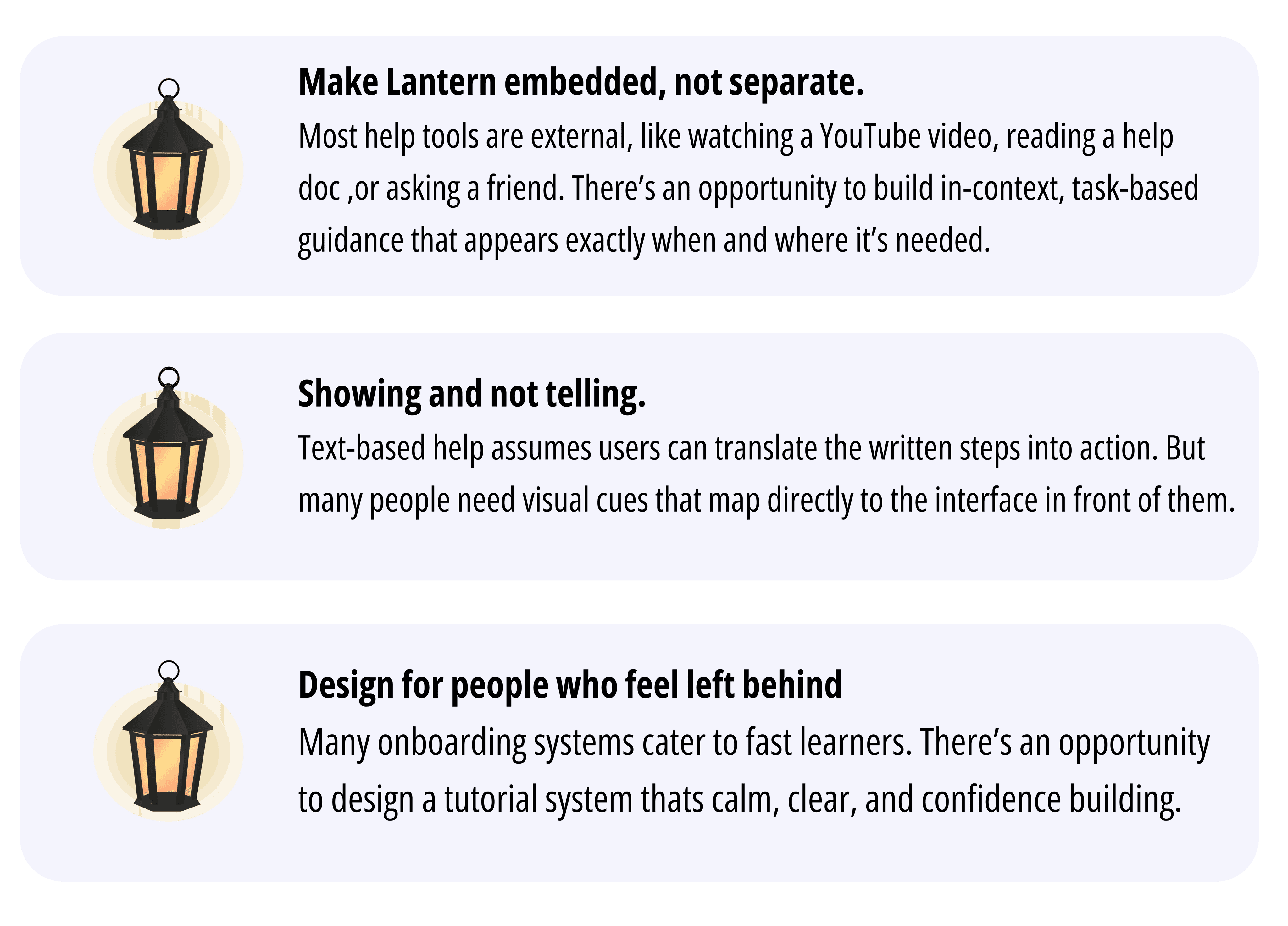
Opportunities
After hearing from users and looking at competing tools, I identified two key opportunities to improve Google Calendar.
After hearing from users and looking at competing tools, I identified two key opportunities to improve Google Calendar.
User Flow

Visual Identity
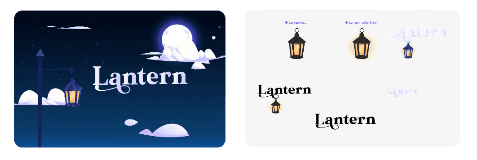
I started by developing the visual identity for Lantern. Inspired by soft, night-mode interfaces and ambient calm, I created a brand direction that leaned into deep blues, muted tones, and clean sans-serif typography. Using Adobe Illustrator, I designed the lantern icon, logo, and the background illustration for the starting screen.
I started by developing the visual identity for Lantern. Inspired by soft, night-mode interfaces and ambient calm, I created a brand direction that leaned into deep blues, muted tones, and clean sans-serif typography. Using Adobe Illustrator, I designed the lantern icon, logo, and the background illustration for the starting screen.
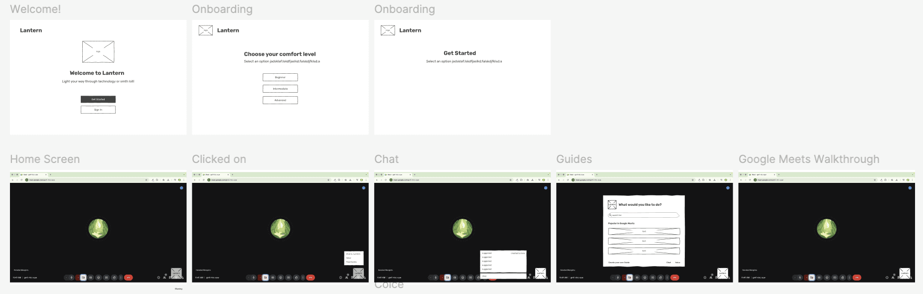
Low-Fidelity Wireframes
We sketched out multiple directions for what Lantern’s guidance could look like. Ideas included:
Overlay walkthroughs that point to UI elements and explain their purpose
Step-by-step flows for multi-stage tasks
A toggleable Elderly Mode with larger fonts and simplified visuals
Optional voice or tooltip hints for extra clarity
These concepts were translated into low-fidelity wireframes to quickly visualize the interaction patterns and pacing.
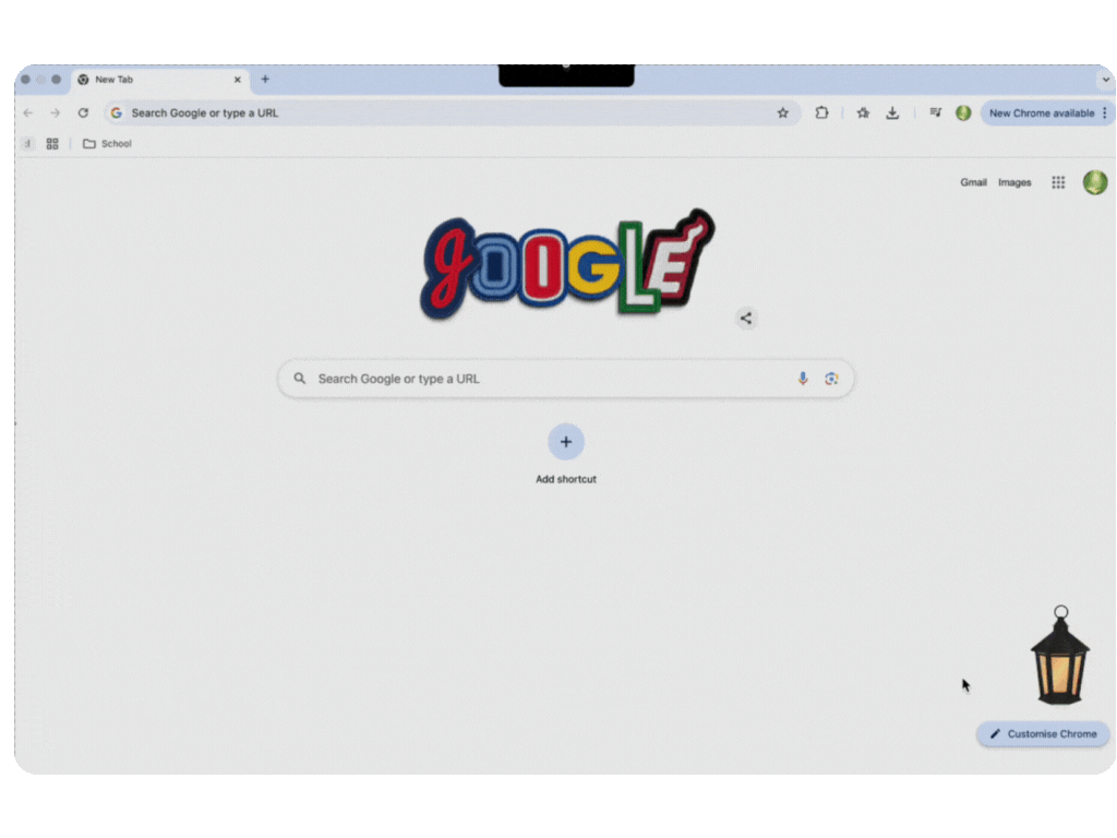
The Redesign
With the structure in place, we moved on to a high-fidelity design. The final prototype, based off of the original logo/brand designs, featured clean typography and intentional spacing to reduce cognitive load.
With the structure in place, we moved on to a high-fidelity design. The final prototype, based off of the original logo/brand designs, featured clean typography and intentional spacing to reduce cognitive load.

Key Takeaways
How to use Adobe Illustrator and Figma hand in hand.
People don't struggle because they're incapable. They struggle because most tools weren't designed to teach.
Even small visual tweaks (larger buttons, plain language) can go a long way.
Simplicity takes effort and empathy.
How to use Adobe Illustrator and Figma hand in hand.
People don't struggle because they're incapable. They struggle because most tools weren't designed to teach.
Even small visual tweaks (larger buttons, plain language) can go a long way.
Simplicity takes effort and empathy.