Papertrails
Papertrails is a story-telling based digital postcard app that lets users collect, explore, and share memories - one virtual postcard at a time. This was made for CreateSC, USC's designathon, in 36 hours with my teammate, Lana Vu.
Papertrails
Papertrails is a story-telling based digital postcard app that lets users collect, explore, and share memories - one virtual postcard at a time. This was made for CreateSC, USC's designathon, in 36 hours with my teammate, Lana Vu.
Role:
UX Designer
Timeline:
May 2025
Tools
Figma, Adobe Illustrator
Context
"I rely on Google Calendar every day to juggle design projects, meetings, and personal life. But while it lets me schedule time, it doesn’t help me stay focused during it - and it gets cluttered fast."
This project started as an exploration into small ways to make Google Calendar feel less like just a timeline and more like a tool to focus and get your stuff done.
Problem Statement
Some travel memories don't always make it to social media, but live vividly in our minds. We wanted to design a way to preserve and share these moments during travel. A space that felt more like a personal archive. Inspired by postcards and map-based discovery, we made Papertrails.
Papertrails is designed for young travelers and creatives, typically aged 20 - 40, who seek more intentional ways to document and share their experiences.
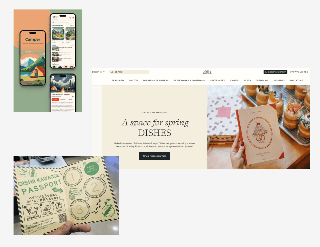
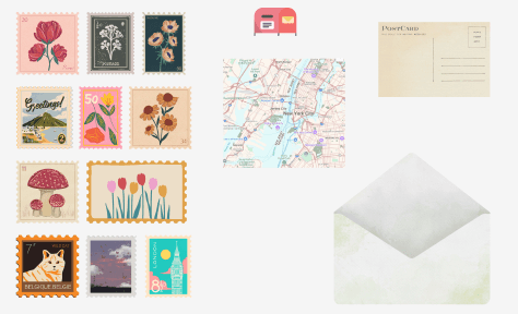
Visual Inspiration
Our visual inspiration pulled from paper textures, stamps, seasonal palettes, and travel keepsakes.
Context & Target Audience
Some travel memories don't always make it to social media, but live vividly in our minds. We wanted to design a way to preserve and share these moments during travel. A space that felt more like a personal archive. Inspired by postcards and map-based discovery, we made Papertrails.
Papertrails is designed for young travelers and creatives, typically aged 20 - 40, who seek more intentional ways to document and share their experiences.
Problem Statement
Some travel memories don't always make it to social media, but live vividly in our minds. We wanted to design a way to preserve and share these moments during travel. A space that felt more like a personal archive. Inspired by postcards and map-based discovery, we made Papertrails.
Papertrails is designed for young travelers and creatives, typically aged 20 - 40, who seek more intentional ways to document and share their experiences.
Visual Inspiration
Our visual inspiration pulled from paper textures, stamps, seasonal palettes, and travel keepsakes.
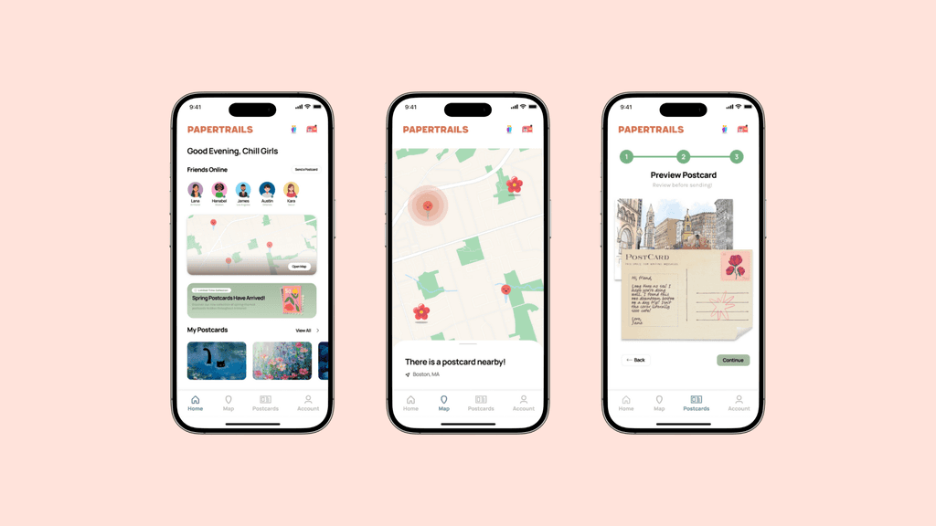
Spatial Discover
We wanted users to find postcards themselves, not just receive them. A map would enhance the experience, letting users explore postcards based on where they traveled to. This choice introduced physicality and curiousity into the app experience.
We wanted:
A home screen that is soft-toned with a zoomable map with glowing pins.
Region-based postcards that gives more travel encouragement.
Postcard Artifacts
Rather than traditional posts or image carousels, we wanted there to be collectible postcards that felt as real as possible.
Each postcard includes local art and their artist handle.
Users can flip the postcards to read the note attached to it, just like a physical card.
Special editions include stamps, stickers, and seasonal themes.
Intentional Sharing
Papertrails should encourage personal and private sharing, like writing a letter to a friend.
Users can write a short message, select a digital stamp, and send a card to their friends.
Sent cards go directly to the recipients mailbox - not anywhere public.
Collection and Seasons
To foster long-term engagement, we introduced a postcard archive where users could revisit or organize what they’ve found and created season specials to bring moments of surprise.
Cards grouped by region, mood, or memory trail
Seasonal visuals and limited-edition postcards encourage repeat visits
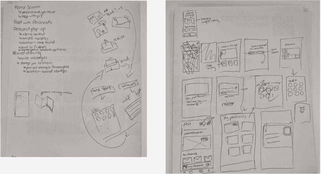
Low-Fidelity Wireframe
We started with basic sketches and lo-fi screens to lock in layout and navigation structure. We tested placement of the map, postcard stack, and share flow. Due to the time constraints we decided on just messily sketching it out on paper.
Spatial Discover
We wanted users to find postcards themselves, not just receive them. A map would enhance the experience, letting users explore postcards based on where they traveled to. This choice introduced physicality and curiousity into the app experience.
We wanted:
A home screen that is soft-toned with a zoomable map with glowing pins.
Region-based postcards that gives more travel encouragement.
Postcard Artifacts
Rather than traditional posts or image carousels, we wanted there to be collectible postcards that felt as real as possible.
Each postcard includes local art and their artist handle.
Users can flip the postcards to read the note attached to it, just like a physical card.
Special editions include stamps, stickers, and seasonal themes.
Intentional Sharing
Papertrails should encourage personal and private sharing, like writing a letter to a friend.
Users can write a short message, select a digital stamp, and send a card to their friends.
Sent cards go directly to the recipients mailbox - not anywhere public.
Collection and Seasons
To foster long-term engagement, we introduced a postcard archive where users could revisit or organize what they’ve found and created season specials to bring moments of surprise.
Cards grouped by region, mood, or memory trail
Seasonal visuals and limited-edition postcards encourage repeat visits
Low-Fidelity Wireframe
We started with basic sketches and lo-fi screens to lock in layout and navigation structure. We tested placement of the map, postcard stack, and share flow. Due to the time constraints we decided on just messily sketching it out on paper.
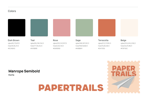
Style Guide
We decided on muted colors that remind of postcards. For our logo I created it in Kittl to save time. We decided on Manrope Semibold and Karla as our font pairing. It's rounded and warm while still being clean.
Style Guide
We decided on muted colors that remind of postcards. For our logo I created it in Kittl to save time. We decided on Manrope Semibold and Karla as our font pairing. It's rounded and warm while still being clean.
High-Fidelity Wireframes
While we had a lot of big ideas, our final prototype delivered the core experience we envisioned: discovering postcards on a map, viewing stories, and sharing them meaningfully - all within the time we had.
High-Fidelity Wireframes
While we had a lot of big ideas, our final prototype delivered the core experience we envisioned: discovering postcards on a map, viewing stories, and sharing them meaningfully - all within the time we had.


Key Takeaways
Good UX can be quiet. We explored how slower interactions like sending a private postcard of finding cool art can be just as impactful as fast, feed-based content. This challenged our assumptions about what "engaging" UX looks like.
Designing under time pressure taught us to prioritize user value.